# 自适应布局 Flex
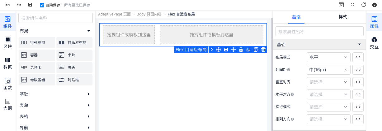
Flex 布局是基于 CSS Flex 实现的布局效果,比用 CSS 类的方式更易用,并且默认使用水平垂直居中的对齐。
# 基础用法
{
  "type": "IvFlex",
  "style": "margin-bottom:16px",
  "children": [
    {
      "type": "IvFlexItem",
      "designer": {
        "move": false,
        "moveSibling": true
      }
    },
    {
      "type": "IvFlexItem",
      "designer": {
        "move": false,
        "moveSibling": true
      },
      "props": {
        "flex": "auto"
      }
    }
  ],
  "props": {
    "mode": "horizontal",
    "gutter": 16
  }
}
# API
# Flex Props
| 属性 | 说明 | 类型 | 默认值 |
|---|---|---|---|
| mode | 布局模式 可选: horizontal vertical | String | horizontal |
| gutter | 栅格间距 建议为4的倍数如: 4 8 16 | Number | 16 |
| align | 垂直对齐方式 可选值: start center end baseline | String | - |
| justify | 水平排列方式 可选值: start center end between around | String | - |
| wrap | 换行模式 可选值: nowrap wrap wrap-reverse | String | - |
| direction | 排列方向 可选值: row row-reverse column column-reverse | String | - |
# FlexItem Props
| 属性 | 说明 | 类型 | 默认值 |
|---|---|---|---|
| flex | 宽度 可选: auto自适应剩余宽度或高度 | String | Number | - |
| align | 垂直对齐方式 可选值: start center end baseline | String | - |