# 扩展组件
接下来演示如何开发一个业务组件,以随机字符串输入为例。
需求如下:
- 点击“生成”按钮自动生成字符串
- 支持设置字符串长度
- 支持设置输入框提示信息
扩展自定义组件,主要分为以下步骤:
- 功能实现:编写vue代码实现业务功能;
- 组件定义:编写Schema描述文件,定义组件及其属性;
- 打包测试:命令行打包组件进行测试;
# 效果预览
实现的目标是在画布里面使用自定义的组件
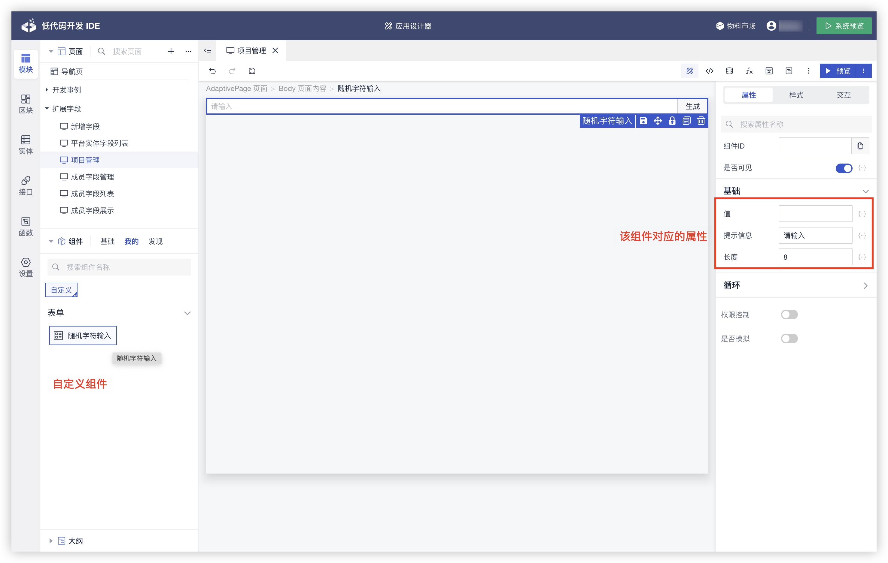
预览运行效果
# 功能实现
# 创建组件
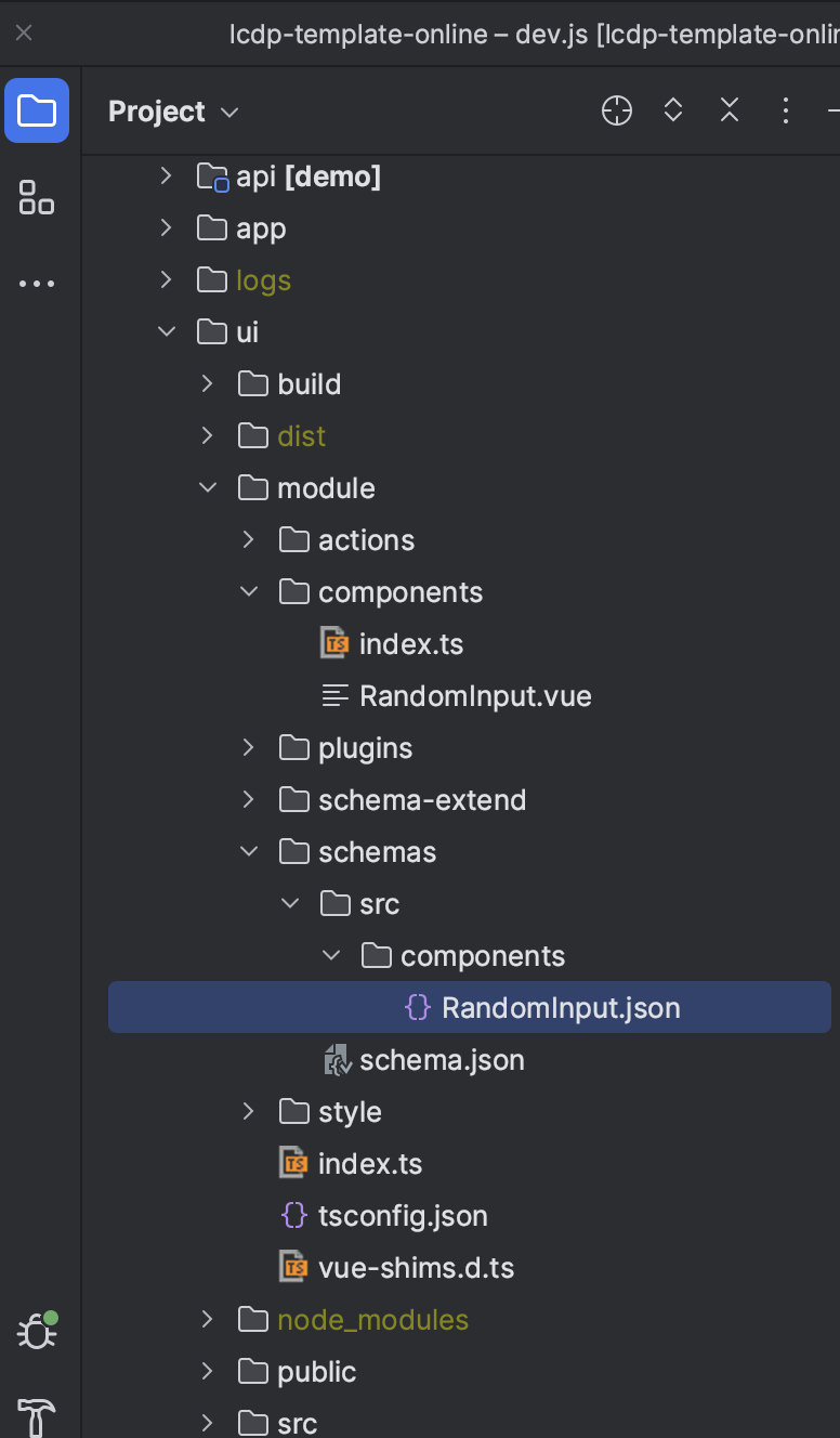
在 ui/module/components 创建 RandomInput.vue 组件,并在同目录下的 index.ts 中导出。
RandomInput.vue
<template>
 <div></div>
</template>
<script lang="ts">
export default {
 ...
}
</script>
index.ts
/** 导出当前目录的扩展组件包 */
import RandomInput from './RandomInput.vue'
export default {
  RandomInput
}
# 开发组件
接下来,我们对 RandomInput.vue 进一步编码,以满足上诉需求。
<template>
  <div>
    <Input v-model="code" :placeholder="placeholder">
      <Button slot="append" @click="generate">生成</Button>
    </Input>
  </div>
</template>
<script lang="ts">
const chars = '0123456789abcdefghijklmnopqrstuvwxyzABCDEFGHIJKLMNOPQRSTUVWXYZ'
export default {
  props: {
    value: {
      type: String,
      default: null
    },
    len: {
      type: Number,
      default: 8
    },
    placeholder: {
      type: String,
      default: '请输入'
    }
  },
  data() {
    return {
      code: this.value
    }
  },
  watch: {
    code(val) {
      this.$emit('input', val)
      this.$emit('on-change', val)
    }
  },
  methods: {
    generate() {
      let result = ''
      for (var i = this.len; i > 0; --i) {
        result += chars[Math.floor(Math.random() * chars.length)]
      }
      this.code = result
    }
  }
}
</script>
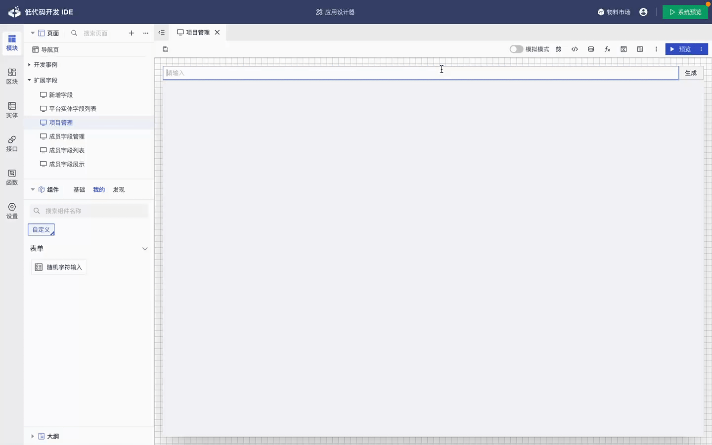
# 测试组件
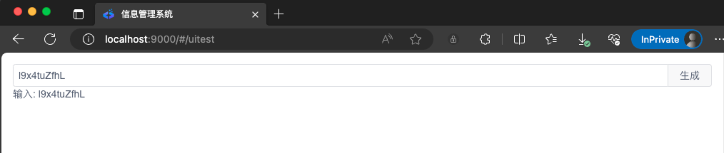
功能开发完成后,我们需要对自定义组件进行测试。 在 uitest.vue 页面引入需要测试的组件。命令行进入 ui 目录,执行 npm run dev ,访问测试的地址:http://localhost:9000/#/uitest 即可进行功能测试。
<template>
  <div class="m-md">
    <RandomInput v-model="text" :len="10" />
    <span>输入: {{ text }}</span>
  </div>
</template>

<script>
import RandomInput from '../../module/components/RandomInput.vue'
export default {
  components: {
    RandomInput
  },
  data() {
    return {
      text: null
    }
  }
}
</script>

<style></style>
测试效果
至此,自定义组件功能已经开发并测试完成。 在进入下一步之前,在 ui 工程下执行 npm run pack ,打包好的组件在 ui/dist/pack 目录下。
# 组件定义
要在页面设计器中使用,必须编写Schema,它是一份描述信息,定义了组件的元数据信息,包括属性,事件,交互等等。Schema是指对组件及其属性的描述。
# 编写Schema
在 ui/module/schemas/src/components 目录下创建 RandomInput.json 描述文件。
{
    "title": "随机字符输入",
    "description": "",
    "group": "自定义/表单",
    "orderNo": 300,
    "icon": "",
    "customicon": "idesignfont ides-form",
    "defType": "component",
    "htmlAttrs": "on",
    "properties": {
        "value": {
            "type": "string",
            "title": "值",
            "group": "基础",
            "orderNo": 0
        },
        "placeholder": {
            "type": "string",
            "title": "提示信息",
            "group": "基础",
            "default": "请输入",
            "orderNo": 1
        },
        "len": {
            "type": "number",
            "title": "长度",
            "group": "基础",
            "default": 8,
            "orderNo": 2
        }
    },
    "events": {
        "on-change": {
            "title": "输入内容改变事件",
            "description": "",
            "group": "交互",
            "orderNo": 0
        }
    }
}
# 属性定义
组件的属性定义,大致的格式如下:
{
 "placeholder": {  // 属性名
      "type": "string",
      "title": "提示信息",
      "group": "基础",
      "default": "请输入",
      "orderNo": 1
  }
}
属性的定义,常见的几个 key:
| 分类 | 描述 | 默认值 |
|---|---|---|
| type | 属性的数据类型 ,支持 string,number,boolean,object,array | string |
| title | 属性标题 | |
| description | 属性详细描述 | |
| group | 属性分组,如不设置会放到“其他”里面 | |
| default | 属性默认值 | |
| orderNo | 属性排序,数值越小,越靠前 | |
| inputType | 用来显示的输入组件: SingleLineText(单行文本输入) Number(数字输入) SingleSelect(下拉单选)MultipleSelect(下拉多选)Boolean(开关)MapEditor (key-value 输入) | SingleLineText |
| expression | 表达式的支持模式包括: on(支持) off(关闭) only(仅支持表达式) | on |
| mock | 模拟数据,设计时生效 |
# 常用inputType参考
SingleLineText(单行文本输入)
"properties": {
  "title": {
      "type": "string",
      "inputType": {  // 可以是字符串,也可以用复杂对象来定义
        "type": "SingleLineText",
        "props": {
          "type": "textarea", // 指定为多行文本
          "rows": 3
        }
      },
      "title": "左侧标题",
      "titleMode": "block",
      "group": "基础配置",
      "orderNo": 0,
      "default": "左侧标题"
    },
}
SingleSelect(下拉单选)
"properties": {
  "type": {
    "type": "string",
    "inputType": "SingleSelect",
    "title": "风格",
    "group": "基础配置",
    "orderNo": 0,
    "default": "style1",
    "enums": [  // 枚举值
      {
        "value": "style1",
        "title": "圆点风格"
      },
      {
        "value": "style2",
        "title": "圆圈风格"
      }
    ]
  }
}
MapEditor(key-value 输入)
"properties": {
  "headers": {
    "type": "object",
    "inputType": {
      "type": "MapEditor",
      "props": {
        "options": {
          "keyTitle": "请求头名",
          "valueTitle": "请求头值",
          "addTitle": "添加请求头"
        }
      }
    },
    "title": "请求头部",
    "titleMode": "none",
    "group": "请求头部",
    "orderNo": 0,
    "expression": "off"
  }
}
# 事件定义
组件的事件定义,大致的格式如下:
{
  "events": {
      "on-change": {  // 事件名,和组件实现代码里面 emit 的事件名称要保持一致
          "title": "输入内容改变事件",
          "description": "",
          "group": "交互",
          "orderNo": 0
      }
  }
}
事件的定义,常见的几个 key:
| 分类 | 描述 | 默认值 |
|---|---|---|
| title | 事件标题 | |
| description | 事件详细描述 | |
| group | 事件分组 | |
| orderNo | 属性排序,数值越小,越靠前 |
# 方法定义
组件的方法定义,大致的格式如下:
{
  "methods": {
      "getBizData": {
        "title":"读取业务数据",
        "orderNo": 1,
        "parameters": [
          {
            "title": "数据key"
          }
        ]
      }
  }
}
如需在编排中执行异常处理时,函数需要return false 或者 return { error : true }
<template>
  <div>
    <Input v-model="code" :placeholder="placeholder">
      <Button slot="append" @click="generate">生成</Button>
    </Input>
  </div>
</template>
<script lang="ts">
const chars = '0123456789abcdefghijklmnopqrstuvwxyzABCDEFGHIJKLMNOPQRSTUVWXYZ'
export default {
  props: {
    value: {
      type: String,
      default: null
    },
    len: {
      type: Number,
      default: 8
    },
    placeholder: {
      type: String,
      default: '请输入'
    }
  },
  data() {
    return {
      code: this.value
    }
  },
  methods: {
    getBizData(){
      return false
      // return { error : true }
    }
  }
}
</script>
# 打包测试
编写完成 Schema 后,需要执行以下命令打包测试:
# 合并生成schema.json, 路径为 module/schemas/schema.json
npm run schema

 # 打包模块
npm run pack


# 拷贝 dist/pack/modules 以及 module/schemas/schema.json 到 app/ui/modules/ 目录下
npm run copyModule
执行成功后,就可以在 IDE 中正常使用自定义组件了。至此,我们就完成了自定义组件的开发,可以根据业务的实际需要自由扩展了!
# 高级定制
# 支持插槽
自定义的组件实现插槽,需要增加 "container": true 配置,否则无法启用。 同时,需要在 Schema 里面,声明 slots。
在 RandomInput.vue 里面写入一个 slot 区域。
<template>
  <div>
    <Input v-model="code" :placeholder="placeholder">
      <Button slot="append" @click="generate">生成</Button>
    </Input>
    <!-- 扩展一个插槽,这里允许放入其他组件 -->
    <slot name="footer"></slot>
  </div>
</template>
<script lang="ts">
const chars = '0123456789abcdefghijklmnopqrstuvwxyzABCDEFGHIJKLMNOPQRSTUVWXYZ'
export default {
  props: {
    value: {
      type: String,
      default: null
    },
    len: {
      type: Number,
      default: 8
    },
    placeholder: {
      type: String,
      default: '请输入'
    }
  },
  data() {
    return {
      code: this.value
    }
  },
  watch: {
    code(val) {
      this.$emit('input', val)
      this.$emit('on-change', val)
    }
  },
  methods: {
    generate() {
      let result = ''
      for (var i = this.len; i > 0; --i) {
        result += chars[Math.floor(Math.random() * chars.length)]
      }
      this.code = result
    }
  }
}
</script>
在 RandomInput.json 里面增加配置。
{
 "container": true, // 需要设置该属性,不然插槽无法使用
 "showDefaultSlot": false, // 默认不显示插槽区域
 "slots": {
        "footer": {  // 插槽名称和代码里面定义的保持一致
            "title": "底部内容",
            "class": "",
            "turnOn":  true
          }
    }
}
# 作用域插槽
{
      "slots":{
        "footer": { // 插槽名称和代码里面定义的保持一致
            "title": "底部内容",
            "turnOn": true,
            "context": {
              "name": "context", // 自定义 用于接收作用域插槽传递参数
              "properties": {
                "propKey":{  //自定义 对应作用域插槽传递参数的key
                    "type": "object"
                }
              }
            }
          }
    }
}
<slot name="footer" :propKey="data"></slot>
在ide中使用 context.propKey 获取作用域插槽传递的参数。
例:
<template>
  <div>
    <p>UserInfo Component</p>
    <slot :user-info="userInfo"></slot>
  </div>
</template>

<script>
export default {
  data() {
    return {
      userInfo: {
        name: '张三',
        age: 18
      }
    }
  }
}
</script>
{
    "title": "用户信息",
    "description": "",
    "group": "自定义/表单",
    "orderNo": 300,
    "icon": "",
    "customicon": "idesignfont ides-form",
    "defType": "component",
    "htmlAttrs": "on",
    "container": true,
    "slots":{
        "default": {
            "title": "默认插槽",
            "context": {
              "name": "context",
              "properties": {
                "userInfo":{
                    "type": "object"
                }
              }
            },
            "turnOn": false
          }
    }
}
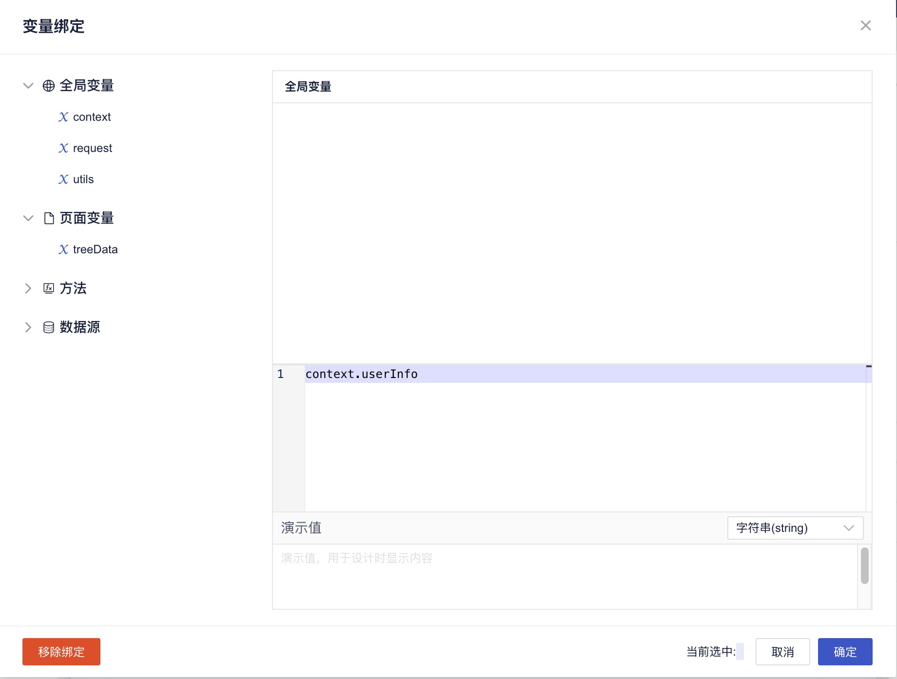
ide使用该组件时,通过context.userInfo获取作用域插槽传递的参数。
# 区分设计器和运行时
在组件中,可以通过 designerService 来控制当前组件在 设计器和运行时的行为。
<template>
  <div>
    <p>UserInfo Component</p>
    {{ !!designerService ? '设计模式' : '运行时' }}
  </div>
</template>

<script>
export default {
  inject: ['designerService'],
  data() {
    return {
    }
  }
}
</script>